Eight ways to perform feature selection with scikit-learn

Feature selection is a crucial step in machine learning that involves selecting the most relevant features from a dataset. By eliminating irrelevant or redundant features, feature selection techniques can improve model performance and efficiency. In this guide, we'll explore some common feature selection techniques and provide code examples using the Boston Housing dataset.
The Boston Housing dataset contains information about housing prices in Boston. It consists of various features such as average number of rooms per dwelling, crime rate, and pupil-teacher ratio. Our goal is to select a subset of features that have the most impact on predicting house prices.
Univariate Feature Selection
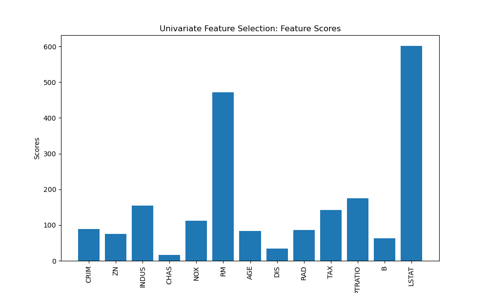
Univariate feature selection evaluates each feature individually based on statistical tests to measure the correlation between each feature and the target variable. Let's visualise the feature scores using a bar plot.
import matplotlib.pyplot as plt
import numpy as np
from sklearn.feature_selection import SelectKBest, f_regression
from sklearn.datasets import load_boston

# Load the Boston Housing dataset
data = load_boston()
X = data.data
y = data.target

# Perform univariate feature selection
selector = SelectKBest(score_func=f_regression, k=5)
X_new = selector.fit_transform(X, y)

# Get the selected feature indices
selected_indices = selector.get_support(indices=True)
selected_features = data.feature_names[selected_indices]

# Get the feature scores
scores = selector.scores_

# Plot the feature scores
plt.figure(figsize=(10, 6))
plt.bar(range(len(data.feature_names)), scores, tick_label=data.feature_names)
plt.xticks(rotation=90)
plt.xlabel('Features')
plt.ylabel('Scores')
plt.title('Univariate Feature Selection: Feature Scores')
plt.show()

print("Selected Features:")
print(selected_features)
Selected Features: ['INDUS' 'RM' 'TAX' 'PTRATIO' 'LSTAT']
In this example, we select the top 5 features using the f_regression score function and visualise the feature scores using a bar plot. The selected features are the ones that have the highest correlation with the target variable. If we had a categorical target instead of a continuous target we might use chi2 instead of using f_regression
Recursive Feature Elimination (RFE)
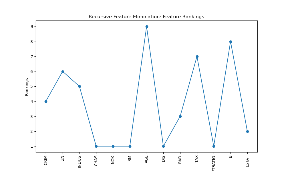
Recursive Feature Elimination (RFE) is an iterative method that starts with all features and recursively eliminates the least important features based on the model's performance. Let's visualise the feature rankings using a line plot.
import matplotlib.pyplot as plt
from sklearn.feature_selection import RFE
from sklearn.linear_model import LinearRegression
from sklearn.datasets import load_boston

# Load the Boston Housing dataset
data = load_boston()
X = data.data
y = data.target

# Perform Recursive Feature Elimination
estimator = LinearRegression()
selector = RFE(estimator, n_features_to_select=5)
X_new = selector.fit_transform(X, y)

# Get the selected feature indices
selected_indices = selector.get_support(indices=True)
selected_features = data.feature_names[selected_indices]

# Get the feature rankings
rankings = selector.ranking_

# Plot the feature rankings
plt.figure(figsize=(10, 6))
plt.plot(range(1, len(rankings) + 1), rankings, marker='o')
plt.xticks(range(1, len(rankings) + 1), data.feature_names, rotation=90)
plt.xlabel('Features')
plt.ylabel('Rankings')
plt.title('Recursive Feature Elimination: Feature Rankings')
plt.show()

print("Selected Features:")
print(selected_features)
Selected Features: ['CHAS' 'NOX' 'RM' 'DIS' 'PTRATIO']
Here, we use LinearRegression as the estimator and select the top 5 features. We visualise the feature rankings using a line plot. Lower ranks indicate more important features.
L1 Regularisation (Lasso)
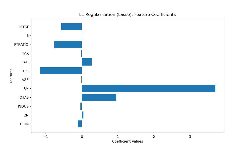
L1 regularisation, also known as Lasso regularisation, applies a penalty term to the linear regression model, encouraging sparse feature weights. This results in some feature weights being driven to zero, effectively selecting only the most relevant features. Let's visualise the feature coefficients using a horizontal bar plot.
import matplotlib.pyplot as plt
from sklearn.linear_model import Lasso
from sklearn.datasets import load_boston

# Load the Boston Housing dataset
data = load_boston()
X = data.data
y = data.target

# Perform L1 regularisation (Lasso)
lasso = Lasso(alpha=0.1)
lasso.fit(X, y)

# Get the non-zero feature coefficients
nonzero_coefs = lasso.coef_
selected_indices = nonzero_coefs != 0
selected_features = data.feature_names[selected_indices]
nonzero_coefs = nonzero_coefs[selected_indices]

# Plot the feature coefficients
plt.figure(figsize=(10, 6))
plt.barh(range(len(nonzero_coefs)), nonzero_coefs, tick_label=selected_features)
plt.xlabel('Coefficient Values')
plt.ylabel('Features')
plt.title('L1 Regularisation (Lasso): Feature Coefficients')
plt.show()

print("Selected Features:")
print(selected_features)
Selected Features: ['CRIM' 'ZN' 'INDUS' 'CHAS' 'RM' 'AGE' 'DIS' 'RAD' 'TAX' 'PTRATIO' 'B' 'LSTAT']
In this example, we apply L1 regularisation with a regularisation strength (alpha) of 0.1. We visualise the non-zero feature coefficients using a horizontal bar plot. The selected features are the ones with non-zero coefficients in the Lasso model.
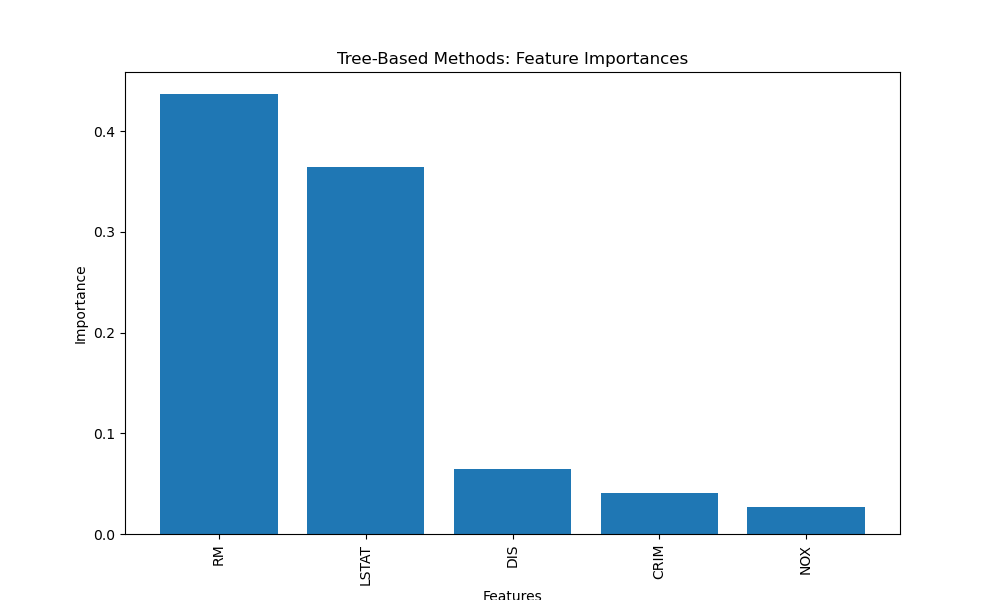
Tree-Based Methods
Tree-based methods, such as Random Forest and Gradient Boosting, inherently perform feature selection by evaluating the importance of each feature in the tree construction process. Let's visualise the feature importances using a bar plot.
import matplotlib.pyplot as plt
from sklearn.ensemble import RandomForestRegressor
from sklearn.datasets import load_boston

# Load the Boston Housing dataset
data = load_boston()
X = data.data
y = data.target

# Perform feature selection using Random Forest
forest = RandomForestRegressor(n_estimators=100)
forest.fit(X, y)

# Get feature importances
importances = forest.feature_importances_

# Sort feature importances in descending order
sorted_indices = importances.argsort()[::-1]

# Select the top k features
k = 5
selected_features = data.feature_names[sorted_indices[:k]]
top_importances = importances[sorted_indices[:k]]

# Plot the feature importances
plt.figure(figsize=(10, 6))
plt.bar(range(len(top_importances)), top_importances, tick_label=selected_features)
plt.xticks(rotation=90)
plt.xlabel('Features')
plt.ylabel('Importance')
plt.title('Tree-Based Methods: Feature Importances')
plt.show()

print("Selected Features:")
print(selected_features)
Selected Features: ['RM' 'LSTAT' 'DIS' 'CRIM' 'NOX']
In this example, we use a Random Forest model with 100 estimators to calculate feature importances. We select the top 5 features based on their importance scores and visualise them using a bar plot.
Principal Component Analysis (PCA)
Principal Component Analysis (PCA) is a dimensionality reduction technique that transforms the original features into a new set of uncorrelated variables called principal components. Let's visualise the explained variance ratio using a bar plot.
import matplotlib.pyplot as plt
from sklearn.decomposition import PCA
from sklearn.datasets import load_boston
# Load the Boston Housing dataset
data = load_boston()
X = data.data
y = data.target
# Perform PCA
pca = PCA(n_components=5)
X_new = pca.fit_transform(X)
# Get the explained variance ratio
explained_variance = pca.explained_variance_ratio_
# Plot the explained variance ratio
plt.figure(figsize=(10, 6))
plt.bar(range(1, len(explained_variance) + 1), explained_variance)
plt.xlabel('Principal Components')
plt.ylabel('Explained Variance Ratio')
plt.title('Principal Component Analysis (PCA): Explained Variance Ratio')
plt.show()
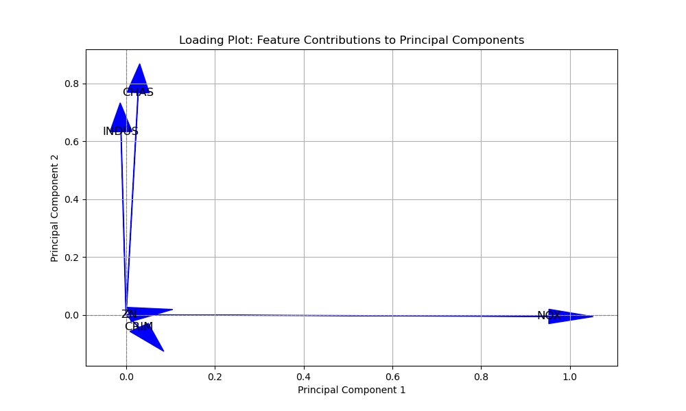
# Get the loadings (principal component vectors)
loadings = pca.components_
# Create a loading plot
plt.figure(figsize=(10, 6))
for i, (loading, feature_name) in enumerate(zip(loadings, data.feature_names)):
plt.arrow(0, 0, loading[0], loading[1], head_width=0.05, head_length=0.1, fc='blue', ec='blue')
plt.text(loading[0], loading[1], feature_name, fontsize=12, ha='center', va='center', color='black')
plt.axhline(y=0, color='gray', linestyle='--', linewidth=0.8)
plt.axvline(x=0, color='gray', linestyle='--', linewidth=0.8)
plt.xlabel('Principal Component 1')
plt.ylabel('Principal Component 2')
plt.title('Loading Plot: Feature Contributions to Principal Components')
plt.grid(True)
plt.show()
Selected Features: ['CHAS' 'INDUS' 'CRIM', 'ZN', 'NOX']
In this example, we select the top 5 principal components that capture the most variance in the data. We visualise the explained variance ratio of these components using a bar plot for the 5 principal components, and a summary in two dimension space with 2 principal components to view the loadings / feature importances.
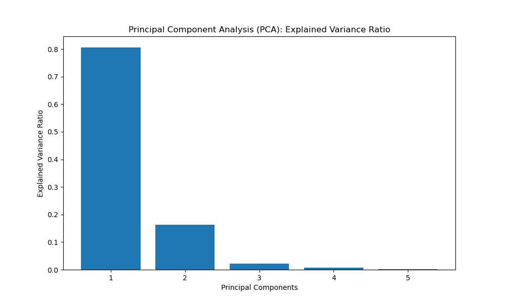
In the PCA example with the bar chart, the importance of variables is not directly represented by the bar heights as in feature importance plots. Instead, PCA focuses on transforming the original features into a new set of uncorrelated variables called principal components. These principal components are linear combinations of the original features and are sorted in descending order of the amount of variance they capture.
The explained variance ratio plot in the PCA example shows the proportion of the total variance in the dataset that each principal component explains. While this plot doesn't directly indicate which original features are the most important, it does help us understand the overall contribution of each principal component to the variability in the data.
In general, when you perform PCA, the first few principal components tend to capture most of the variance in the dataset. Therefore, the original features that contribute the most to these early principal components can be considered more important in terms of explaining the dataset's variability.
However, identifying which specific original features contribute most to a particular principal component can be challenging due to the linear combination nature of principal components. If you need to understand the relationship between the original features and specific principal components, you might need to perform further analysis, such as looking at the loadings of the principal components, which represent the contribution of each original feature to the construction of the principal component.
In summary, in a PCA analysis, the focus is more on understanding the variability and relationships between variables rather than directly identifying the "most important" variables as you would in other feature selection methods.
Correlation-based Feature Selection
Correlation-based feature selection measures the correlation between each feature and the target variable, as well as the correlation between different features. Let's visualise the feature correlations using a heatmap.
import matplotlib.pyplot as plt
import numpy as np
import seaborn as sns
from sklearn.datasets import load_boston

# Load the Boston Housing dataset
data = load_boston()
X = data.data
y = data.target

# Calculate feature correlations with target variable
correlations = np.abs(np.corrcoef(X.T, y)[:X.shape[1], -1])
sorted_indices = correlations.argsort()[::-1]

# Select the top k features
k = 5
selected_features = data.feature_names[sorted_indices[:k]]
top_correlations = correlations[sorted_indices[:k]]

print("Selected Features with correlation:")
print(selected_features)
print(top_correlations)
Selected Features with correlation:
['LSTAT' 'RM' 'PTRATIO' 'INDUS' 'TAX']
[0.73766273 0.69535995 0.50778669 0.48372516 0.46853593]
In this example, we calculate the absolute correlations between each feature and the target variable. We select the top 5 features with the highest correlations to the target variable y.
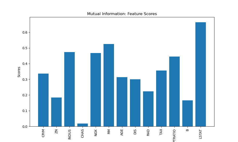
Mutual Information
Mutual information measures the statistical dependency between two variables. In the context of feature selection, it quantifies the amount of information that one feature provides about the target variable. Let's visualise the feature scores using a bar plot.
import matplotlib.pyplot as plt
from sklearn.feature_selection import SelectKBest, mutual_info_regression
from sklearn.datasets import load_boston

# Load the Boston Housing dataset
data = load_boston()
X = data.data
y = data.target

# Perform mutual information feature selection
selector = SelectKBest(score_func=mutual_info_regression, k=5)
X_new = selector.fit_transform(X, y)

# Get the selected feature indices
selected_indices = selector.get_support(indices=True)
selected_features = data.feature_names[selected_indices]

# Get the feature scores
scores = selector.scores_

# Plot the feature scores
plt.figure(figsize=(10, 6))
plt.bar(range(len(data.feature_names)), scores, tick_label=data.feature_names)
plt.xticks(rotation=90)
plt.xlabel('Features')
plt.ylabel('Scores')
plt.title('Mutual Information: Feature Scores')
plt.show()

print("Selected Features:")
print(selected_features)
Selected Features: ['INDUS' 'NOX' 'RM' 'PTRATIO' 'LSTAT']
In this example, we select the top 5 features based on mutual information scores using the mutual_info_regression score function. We visualise the feature scores using a bar plot. This method is also good for datasets with a categorical target but instead of using 'mutual_info_regression' as the score_func we would import and use 'mutual_info_classif' instead.
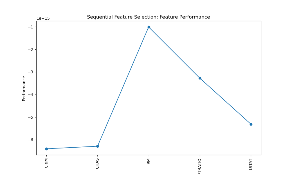
Sequential Feature Selection
Sequential Feature Selection is a method that combines multiple feature subsets and evaluates their performance using a machine learning model. Let's visualise the feature performance using a line plot.
import matplotlib.pyplot as plt
import numpy as np
from sklearn.feature_selection import SequentialFeatureSelector
from sklearn.linear_model import LinearRegression
from sklearn.datasets import load_boston

# Load the Boston Housing dataset
data = load_boston()
X = data.data
y = data.target

# Perform sequential feature selection
estimator = LinearRegression()
selector = SequentialFeatureSelector(estimator, n_features_to_select=5, direction='forward')
selector.fit(X, y)

# Get the selected feature indices
selected_indices = np.where(selector.support_)[0]
selected_features = data.feature_names[selected_indices]

# Get the feature performance (manually store performance scores)
performance = []

for step in range(1, len(selected_indices) + 1):
    subset_indices = selected_indices[:step]
    X_subset = X[:, subset_indices]
    score = -np.mean(np.abs(np.mean(LinearRegression().fit(X_subset, y).predict(X_subset) - y)))
    performance.append(score)

# Plot the feature performance
plt.figure(figsize=(10, 6))
plt.plot(range(1, len(performance) + 1), performance, marker='o')
plt.xticks(range(1, len(performance) + 1), selected_features, rotation=90)
plt.xlabel('Features')
plt.ylabel('Performance')
plt.title('Sequential Feature Selection: Feature Performance')
plt.show()

print("Selected Features:")
print(selected_features)
Selected Features: ['CRIM' 'CHAS' 'RM' 'PTRATIO' 'LSTAT']
In this example, we use LinearRegression as the estimator and select the top 5 features using the forward selection approach. We visualise the feature performance using a line plot.
Conclusion
In conclusion, feature selection techniques are essential for improving machine learning models by selecting the most relevant features and reducing dimensionality. In this guide, we explored various techniques and applied them to the Boston Housing dataset.
By incorporating these feature selection techniques into your machine learning workflow, you can enhance model performance, reduce overfitting, and gain better insights into the underlying data patterns. Consider experimenting with different techniques and evaluating their impact on your specific dataset and task to identify the most effective feature subset. Ultimately, feature selection empowers you to build more robust, interpretable models that deliver accurate predictions and valuable insights.