How to create an interactive correlation heatmap using Danfo.js and Plotly
In this short article, we'll look at how create a Pearson correlation heatmap visual using Danfo.js and Plotly.js and then display it in an HTML page using JavaScript.
I recently came across this issue whilst building the Data Explorer Workbench tool in which I needed to calculate and display correlation between variables in the dataset using only JavaScript. Data Explorer Workbench is a web based tool for automated exploratory data analysis (EDA) where you can upload a CSV dataset and explore descriptive statistics, relationships and correlation. I was using Vue.js as the framework here, although you can amend the steps to other frameworks or a static HTML file.
When it comes to data visualisation, heatmaps are a powerful tool for exploring relationships and patterns in your dataset. Heatmaps allow you to visualise the correlation between different variables, making it easier to identify trends and dependencies.
What is a Correlation Heatmap?
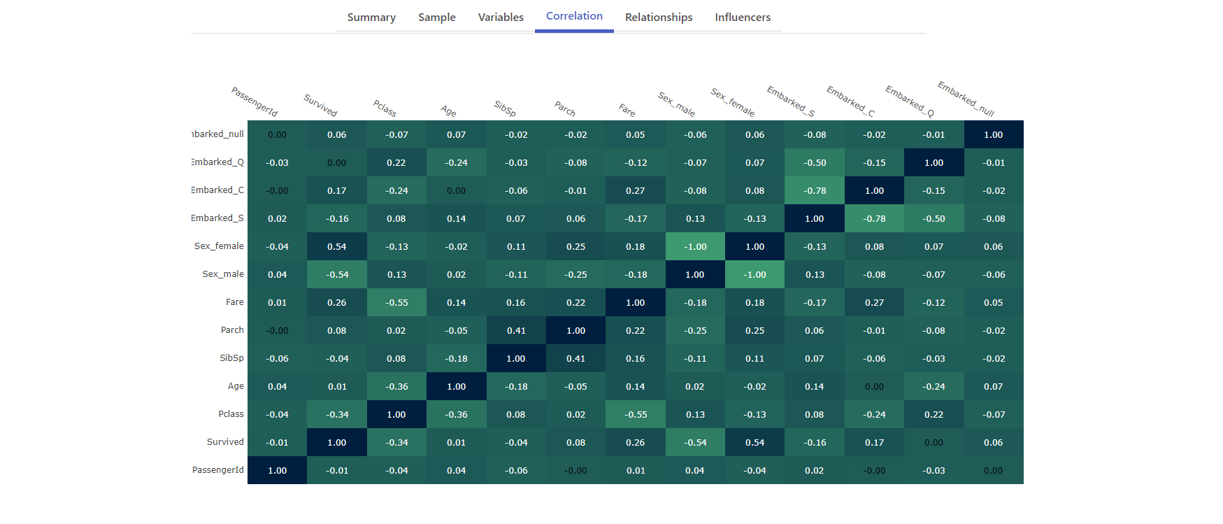
A correlation heatmap is a graphical representation of the correlation matrix, which shows the correlation coefficients between multiple variables in a dataset. Each cell in the heatmap represents the correlation between two variables, with colors indicating the strength and direction of the correlation. Heatmaps are commonly used in data analysis to identify relationships between variables, especially in fields like finance, healthcare, and social sciences.
Getting Started
Before we dive into creating a correlation heatmap, you'll need to have Node installed on your system. Additionally, you'll need to install the danfo and plotly libraries. You can do this using Node and npm:
npm i danfojs-node
npm i plotly.js
Once you have the required libraries installed, let's move on to the step-by-step process of creating a correlation heatmap.
Step 0: Create the HTML chart placeholder
<div id="correlation-heatmap">
    <!-- Plotly Heatmap will go here -->
</div>
This gives us a div container where the correlation heatmap will be placed.
Step 1: Importing the libraries
The first step is to import the necessary libraries:
import * as dfd from "danfojs";
import Plotly from 'plotly.js-dist-min';
We use danfo for data manipulation and plotly for creating interactive visualisations.
Step 2: The corr function
You will see in the next step we require a corr function to calculate the Pearson correlation value for each variable.
/*
* Calculates Pearson correlation between
* two arrays x and y.
*/
corr(x, y) {
    let sumX = 0,
        sumY = 0,
        sumXY = 0,
        sumX2 = 0,
        sumY2 = 0;

    const minLength = x.length = y.length = Math.min(x.length, y.length),
            reduce = (xi, idx) => {
            const yi = y[idx];
            sumX += xi;
            sumY += yi;
            sumXY += xi * yi;
            sumX2 += xi * xi;
            sumY2 += yi * yi;
            }

    x.forEach(reduce);

    return (minLength * sumXY - sumX * sumY) /
            Math.sqrt((minLength * sumX2 - sumX * sumX) * (minLength * sumY2 - sumY * sumY));
}
Step 3: Loading the data and display the heatmap
Now, you need to load your dataset into a DataFrame using danfo. For the purpose of this tutorial, let's assume you have a CSV file named your_data.csv containing your dataset. You can load an example Titanic dataset from a GitHub repo as follows:
dfd.readCSV("https://raw.githubusercontent.com/datasciencedojo/datasets/master/titanic.csv")
  .then(df => {
        df.head().print()

        /**
         * Generate heatmap
         * This needs to be in the format of
         *  zValues = [
         *     [0.00, 0.00, 0.75, 0.75, 1.00],
         *     [0.00, 0.00, 0.75, 1.00, 0.00],
         *     [0.75, 0.75, 1.00, 0.75, 0.75],
         *     [0.00, 1.00, 0.00, 0.75, 0.00],
         *     [1.00, 0.00, 0.00, 0.75, 0.00]
         *  ];
         */
        let zValues = [];
        let dfCopy = df.copy();
        let columnsLength = dfCopy.shape[1];
        let columnsToDrop = [];
        let numericColumns = dfCopy.selectDtypes([
              'int32',
              'float32',
          ]);

        // Drop columns with high cardinality (many unique values)
        for (let i = 0; i < columnsLength; i++) {
          let column = dfCopy.columns[i];

          // Skip if a numeric column as it will have lots of unique values
          // but this doesn't matter :)
          if (numericColumns.$columns.includes(column)) {
            continue;
          }

          let uniqueValuesCount = dfCopy.column(column).unique().$data.length;

          if (uniqueValuesCount > 5) {
            columnsToDrop.push(column);
          }
        }

        dfCopy.drop({ columns: columnsToDrop, inplace: true });

        // Create dummy columns for categoric variables
        let dummies = dfCopy.getDummies(dfCopy);
        // Uncomment to debug: console.log("DUMMIES", dummies);
        columnsLength = dummies.$columns.length;

        for (let i = 0; i < columnsLength; i++) {
          let column = dummies.$columns[i];
          // Uncomment to debug: console.log("COMPARING", column);
          let correlations = [];

          for (let j = 0; j < columnsLength; j++) {
            let comparisonColumn = dummies.$columns[j];
            // Uncomment to debug: console.log("TO", comparisonColumn);

            let pearsonCorrelation = corr(
              dummies[column].$data,
              dummies[comparisonColumn].$data
            ).toFixed(2)

            correlations.push(
              pearsonCorrelation
            );
          }

          zValues.push(correlations);
        }

        var xValues = dummies.$columns;
        var yValues = dummies.$columns;

        var colorscaleValue = [
          [0, '#3D9970'],
          [1, '#001f3f']
        ];

        var data = [{
          x: xValues,
          y: yValues,
          z: zValues,
          type: 'heatmap',
          colorscale: colorscaleValue,
          showscale: false
        }];

        var layout = {
          autosize: false,
          width: window.innerWidth - 650,
          height: 700,
          annotations: [],
          xaxis: {
            ticks: '',
            side: 'top'
          },
          yaxis: {
            ticks: '',
            ticksuffix: ' ',
            autosize: false
          }
        };

        for ( var i = 0; i < yValues.length; i++ ) {
          for ( var j = 0; j < xValues.length; j++ ) {
            var currentValue = zValues[i][j];
            if (currentValue != 0.0) {
              var textColor = 'white';
            }else{
              var textColor = 'black';
            }
            var result = {
              xref: 'x1',
              yref: 'y1',
              x: xValues[j],
              y: yValues[i],
              text: zValues[i][j],
              font: {
                family: 'Arial',
                size: 12,
                color: 'rgb(50, 171, 96)'
              },
              showarrow: false,
              font: {
                color: textColor
              }
            };
            layout.annotations.push(result);
          }
        }

        Plotly.newPlot('correlation-heatmap', data, layout);
  }).catch(err=>{
     console.log(err);
  })
The length of this code can be made more concise by introducing functions. However, here we are performing a number of preprocessing steps before calculating the correlation coefficient with corr:
- Reading the dataset with Danfo
- Copying the dataset to work on it
- Identifying the numeric type columns in the dataset
- Dropping columns with high cardinality (many unique values)
- Creating dummy columns for categoric variables
Bonus: Using just plain HTML and JavaScript
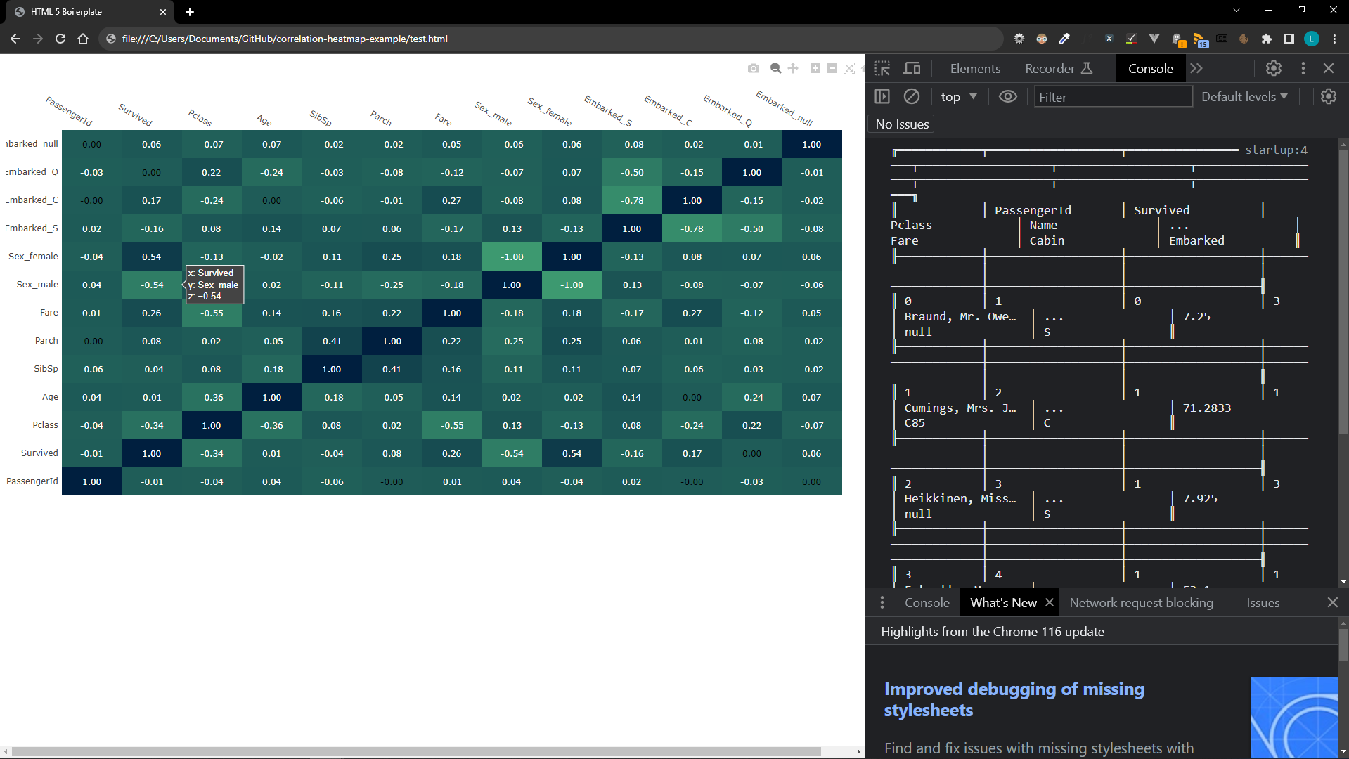
That's the whole process done with the heatmap created! If you prefer not to use Node and NPM with a framework, you can give this minimal working example using just plain HTML and JavaScript a go. In this example we are just importing both Danfo and Plotly from a CDN.
<!DOCTYPE html>
<html lang="en">

<head>
  <meta charset="UTF-8">
  <meta name="viewport" content="width=device-width, initial-scale=1.0">
  <meta http-equiv="X-UA-Compatible" content="ie=edge">
  <title>HTML 5 Boilerplate</title>
  <script src="https://cdn.plot.ly/plotly-2.25.2.min.js" charset="utf-8"></script>
  <script src="https://cdn.jsdelivr.net/npm/danfojs@1.1.2/lib/bundle.min.js"></script>
</head>

<body>

  <div id="correlation-heatmap" style="height: 800px; width: 1000px">
    <!-- Plotly Heatmap will go here -->
  </div>

</body>

<script>
  /*
  * Calculates Pearson correlation between
  * two arrays x and y.
  */
  function corr(x, y) {
    let sumX = 0,
      sumY = 0,
      sumXY = 0,
      sumX2 = 0,
      sumY2 = 0;

    const minLength = x.length = y.length = Math.min(x.length, y.length),
      reduce = (xi, idx) => {
        const yi = y[idx];
        sumX += xi;
        sumY += yi;
        sumXY += xi * yi;
        sumX2 += xi * xi;
        sumY2 += yi * yi;
      }

    x.forEach(reduce);

    return (minLength * sumXY - sumX * sumY) /
      Math.sqrt((minLength * sumX2 - sumX * sumX) * (minLength * sumY2 - sumY * sumY));
  }

  dfd.readCSV("https://raw.githubusercontent.com/datasciencedojo/datasets/master/titanic.csv")
    .then(df => {
      df.head().print()

      /**
       * Generate heatmap
       * This needs to be in the format of
       *  zValues = [
       *     [0.00, 0.00, 0.75, 0.75, 1.00],
       *     [0.00, 0.00, 0.75, 1.00, 0.00],
       *     [0.75, 0.75, 1.00, 0.75, 0.75],
       *     [0.00, 1.00, 0.00, 0.75, 0.00],
       *     [1.00, 0.00, 0.00, 0.75, 0.00]
       *  ];
       */
      let zValues = [];
      let dfCopy = df.copy();
      let columnsLength = dfCopy.shape[1];
      let columnsToDrop = [];
      let numericColumns = dfCopy.selectDtypes([
        'int32',
        'float32',
      ]);

      // Drop columns with high cardinality (many unique values)
      for (let i = 0; i < columnsLength; i++) {
        let column = dfCopy.columns[i];

        // Skip if a numeric column as it will have lots of unique values
        // but this doesn't matter :)
        if (numericColumns.$columns.includes(column)) {
          continue;
        }

        let uniqueValuesCount = dfCopy.column(column).unique().$data.length;

        if (uniqueValuesCount > 5) {
          columnsToDrop.push(column);
        }
      }

      dfCopy.drop({ columns: columnsToDrop, inplace: true });

      // Create dummy columns for categoric variables
      let dummies = dfCopy.getDummies(dfCopy);
      // Uncomment to debug: console.log("DUMMIES", dummies);
      columnsLength = dummies.$columns.length;

      for (let i = 0; i < columnsLength; i++) {
        let column = dummies.$columns[i];
        // Uncomment to debug: console.log("COMPARING", column);
        let correlations = [];

        for (let j = 0; j < columnsLength; j++) {
          let comparisonColumn = dummies.$columns[j];
          // Uncomment to debug: console.log("TO", comparisonColumn);

          let pearsonCorrelation = corr(
            dummies[column].$data,
            dummies[comparisonColumn].$data
          ).toFixed(2)

          correlations.push(
            pearsonCorrelation
          );
        }

        zValues.push(correlations);
      }

      var xValues = dummies.$columns;
      var yValues = dummies.$columns;

      var colorscaleValue = [
        [0, '#3D9970'],
        [1, '#001f3f']
      ];

      var data = [{
        x: xValues,
        y: yValues,
        z: zValues,
        type: 'heatmap',
        colorscale: colorscaleValue,
        showscale: false
      }];

      var layout = {
        autosize: false,
        width: window.innerWidth - 650,
        height: 700,
        annotations: [],
        xaxis: {
          ticks: '',
          side: 'top'
        },
        yaxis: {
          ticks: '',
          ticksuffix: ' ',
          autosize: false
        }
      };

      for (var i = 0; i < yValues.length; i++) {
        for (var j = 0; j < xValues.length; j++) {
          var currentValue = zValues[i][j];
          if (currentValue != 0.0) {
            var textColor = 'white';
          } else {
            var textColor = 'black';
          }
          var result = {
            xref: 'x1',
            yref: 'y1',
            x: xValues[j],
            y: yValues[i],
            text: zValues[i][j],
            font: {
              family: 'Arial',
              size: 12,
              color: 'rgb(50, 171, 96)'
            },
            showarrow: false,
            font: {
              color: textColor
            }
          };
          layout.annotations.push(result);
        }
      }

      console.log(data);

      Plotly.newPlot('correlation-heatmap', data, layout);
    }).catch(err => {
      console.log(err);
    })

</script>

</html>
This produces the below HTML page.
Conclusion
Creating a correlation heatmap is a valuable step in data analysis and visualisation. It helps you quickly identify relationships and patterns within your dataset, which can lead to valuable insights.
In this article, we've demonstrated how to create a correlation heatmap using the Danfo and Plotly libraries in JavaScript. By following these steps, you can easily generate interactive heatmaps for your own datasets, enabling you to explore and understand your data more effectively.
Remember that data visualisation is not only about creating pretty charts but also about gaining insights and making data-driven decisions. Heatmaps are just one of the many tools at your disposal for this purpose, and they can be a powerful addition to your data analysis toolkit.
I am really excited by Danfo which brings Pandas style data manipulation and data analysis to JavaScript. I hope more articles utilising this library will be coming soon.
If you enjoyed this article be sure to check out other articles on the site. If you have any questions feel free to leave a comment 👍