Understanding Explainable AI (XAI) for classification, regression and clustering with Python
Introduction
Artificial Intelligence (AI) has become an integral part of our lives, with its applications spanning across various domains. However, one major concern associated with AI is its lack of transparency and explainability. In recent years, there has been a growing demand for Explainable AI (XAI) techniques that aim to shed light on the decision-making processes of AI models. In this blog post, we will explore the concepts of XAI in the context of classification, regression, and clustering, and understand how these techniques can enhance the interpretability and trustworthiness of AI systems.
The primary goal of AI and machine learning is to build models that can analyse and interpret complex data, recognise patterns, make predictions or decisions, detect anomalies, optimise processes and adapt their behavior based on new information without too much human expertise or explicit programming.
Use the contents menu above to jump to classification, regression or clustering examples based on your interests. I carried out these analyses in the Spyder IDE.
Classification and Explainable AI
Classification is a fundamental task in AI that involves assigning input data points to predefined categories or classes. Explainable AI techniques in classification aim to provide insights into how a model arrived at a particular classification decision. Let's take a closer look at some XAI methods commonly used in classification:
-
Feature Importance: Feature importance techniques help identify which input features contribute the most to the classification decision. These methods assign scores or weights to each feature, allowing us to understand the relative importance of different inputs.
-
Rule Extraction: Rule extraction methods attempt to extract a set of human-interpretable rules from a trained classification model. These rules provide a transparent representation of how the model makes decisions, enabling easier comprehension.
-
Local Explanations: Local explanation methods focus on explaining individual predictions by highlighting the relevant features and their impact on the decision. Techniques like LIME (Local Interpretable Model-agnostic Explanations) generate locally faithful explanations that explain model behavior at specific instances.
Explainable models aim to address the "black box" nature of traditional classification models by providing insights into the underlying factors and reasoning behind each classification prediction. Here are some popular explainable classification models:
-
Decision Trees: Decision trees are intuitive and transparent models that make decisions based on a sequence of rules. Each internal node represents a decision based on a specific feature, and each leaf node represents a class label. Decision trees provide a clear path of decision-making, making them inherently explainable.
-
Rule-Based Models: Rule-based models generate a set of if-then rules that define the decision boundaries of the classification model. These rules are typically human-readable and provide a transparent representation of the decision-making process.
-
Logistic Regression with L1 Regularisation: Logistic regression models with L1 regularisation can result in sparse solutions where only a subset of the input features is used for classification. This sparsity property allows for feature selection, indicating which features are most important for the classification decision.
Decision Tree Classifier example
To demonstrate the process, we will use a scikit-learn Decision Tree Classifier with the Titanic dataset to train a model to predict whether a passenger survived the disaster. It's a common and well known dataset, so perfect for learning the XAI process.
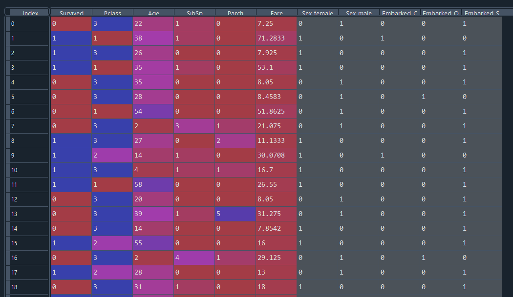
We first import packages, read and prepare the dataset for the model, and split the data into training and testing sets. The training set (80% of the data) will be used to train the model, and the test set (20% of the data) acts as 'unseen data' to see how well the model works. Finally, we create a Decision Tree Classifier and train the model on the training set.
import numpy as np
import pandas as pd
from sklearn.model_selection import train_test_split
from sklearn.tree import DecisionTreeClassifier
from sklearn import tree
from sklearn.metrics import confusion_matrix, accuracy_score, classification_report
import matplotlib.pyplot as plt
import seaborn as sns

# Load the dataset
url = 'https://raw.githubusercontent.com/datasciencedojo/datasets/master/titanic.csv'
data = pd.read_csv(url)

# Handle missing values
data.fillna(value={'Age': data['Age'].median()}, inplace=True)
data.fillna(value={'Embarked': data['Embarked'].mode()[0]}, inplace=True)

# Remove unnecessary columns
data.drop(['PassengerId', 'Name', 'Ticket', 'Cabin'], axis=1, inplace=True)

# Encode categorical variables
data = pd.get_dummies(data, columns=['Sex', 'Embarked'])

# Split the data into features and target variable
X = data.drop('Survived', axis=1)
y = data['Survived']

# Split the data into training and testing sets
X_train, X_test, y_train, y_test = train_test_split(X,
                                                    y,
                                                    test_size=0.2,
                                                    random_state=42)

# Initialize the decision tree classifier
model = DecisionTreeClassifier(max_depth=3)

# Train the model
model.fit(X_train, y_train)
The prepared data looks like this.
We now really want to explain how well this model has performed, what features are important to the model's decison making and how well we expect it to perform on new data. We can first check training set accuracy as a benchmark and feature importances. Later we will check the testing set (unseen data) accuracy.
# Assess accuracy
train_accuracy = round(model.score(X_train, y_train) * 100, 2)

# Plot the feature importances
importances = model.feature_importances_
indices = np.argsort(importances)[::-1]
feature_names = X_train.columns
sorted_feature_names = feature_names[indices]

plt.figure()
plt.title("Feature importance")
plt.bar(range(X_train.shape[1]), importances[indices], align="center")
plt.xticks(range(X_train.shape[1]), sorted_feature_names, rotation='vertical')
plt.xlabel("Feature")
plt.ylabel("Importance")
plt.show()
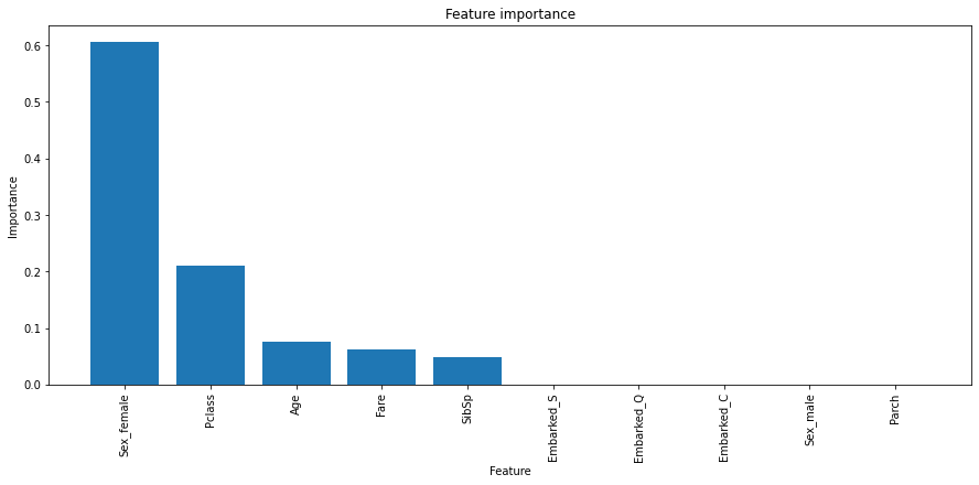
The training accuracy returns 83.43% and the feature importances show that Sex_female, Pclass, Age has the largest importance on the model's decisions. So this model can correctly classify 83.43% of this dataset. Not a bad start.
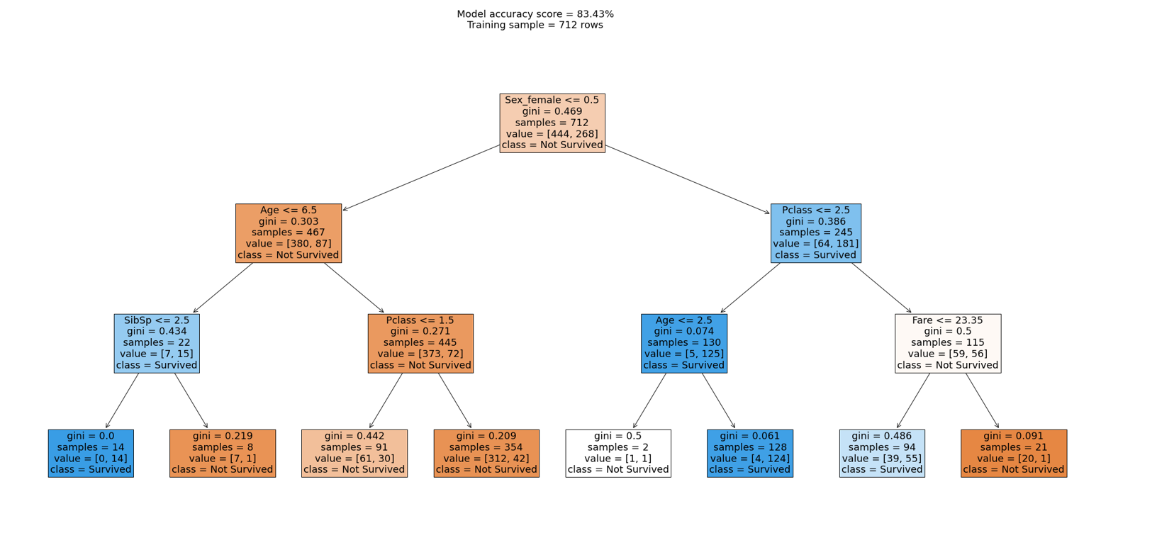
We can further break this down by visualising the decision tree.
# Plot the decision tree
fig = plt.figure(figsize=(35, 15))
plot = tree.plot_tree(model,
                      feature_names=X.columns,
                      class_names=['Not Survived', 'Survived'],
                      filled=True,
                      fontsize=18)

plt.suptitle(f"Model accuracy score = {train_accuracy}%\nTraining sample = {len(X_train)} rows",
             fontsize=18)
plt.savefig("tree.png")
Let's interpret how the decision tree would classify a 30 year old male named Mike who was in passenger class 3.
1st condition
Sex_female (Mike=1) <= 0.5 ~ True
Mike fulfils the condition; we move to the left side of the tree.
2nd condition
Age (Mike=30.0) <= 6.5 ~ False
Mike doesn't fulfil the condition; we move to the right side of the tree.
3rd condition
Pclass (Mike=3) <= 1.5 ~ False
Mike doesn't fulfil the condition; we move to the right side of the tree.
Last node
The ultimate node, the leaf, tells us that the training dataset contained 354 males with a passenger class more than 1.5 of which > 42 survived (1) but 312 (0) didn't survive.
Therefore, the chances of Mike surviving according to this model are 42 divided by 354:
42 / 354 = 0.1186440677966102
We get the answer that Mike had a 11.86% chance of surviving the Titanic accident and can understand how the model arrived at such a decision. We can confirm this later when passing in brand new data for the model to predict on.
Things to remember when interpreting decision tree diagrams:
-
Nodes: Each node in the tree represents a decision point based on a specific feature and threshold. The topmost node is the root node, and subsequent nodes are internal nodes. The leaf nodes represent the final predictions.
-
Splits: The edges or branches between nodes indicate the splits based on the feature and threshold values. For example, if a sample's feature value is greater than the threshold, it follows the right branch; otherwise, it follows the left branch.
-
Gini Impurity or Information Gain: The plot_tree visual may also include measures such as Gini impurity or information gain. These metrics reflect the impurity or the amount of information gained by the split at each node. Lower values indicate more homogeneous child nodes, indicating better splits. In general, the Gini impurity ranges from 0 to 1, where 0 represents a perfectly pure node (all elements belong to the same class) and 1 represents a maximally impure node (elements are evenly distributed across all classes).
-
Colors: By setting
filled=Truein theplot_treefunction, the plot is filled with colors to represent the majority class in each node. The color intensity reflects the class distribution or the probability of each class. -
Samples: The plot may display the number of samples or observations that reach each node. It provides insights into the data distribution and the number of instances at different decision points.
-
Value: Refers to the target or output variable that the decision tree is trying to predict or classify at each node. At each internal node of the tree, a decision is made based on a feature and its threshold, leading to a different branch depending on whether the condition is satisfied or not. Eventually, the tree reaches the leaf nodes, which correspond to the final predicted classes.
-
Class: Refers to the distribution or count of samples belonging to each class at a specific node or leaf of the decision tree. This provides a breakdown of the samples in that node or leaf based on their class labels. It indicates the number of instances or the distribution of classes within that particular subset of the data. For example, the top node shows class=[444, 268] which means 444 did not survive and 268 survived.
-
Feature Importance: The decision tree visual allows you to infer feature importance based on the position and depth of the features within the tree. Features closer to the root node are more influential in the decision-making process.
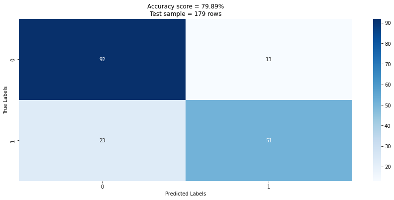
We can now also get a sense for how the model performed overall on the testing set by using a confusion matrix. We can see that the prediction success drops to 79.89% when applied to the test set (unseen data). We can see of the total test set of 179 records the model predicted 143 (92 + 51) correctly and 36 (13 + 23) incorrectly. This is an accuracy score of 143 / 179 = 0.79888 which confirms our score.
# Plot a confusion matrix to assess prediction success
y_pred = model.predict(X_test)
test_accuracy = round(accuracy_score(y_test, y_pred) * 100, 2)
cm = confusion_matrix(y_test, y_pred)

plt.figure(figsize=(8, 6))
sns.heatmap(cm, annot=True, fmt="d", cmap="Blues")
plt.title(f"Accuracy score = {test_accuracy}%\nTest sample = {len(X_test)} rows")
plt.xlabel("Predicted Labels")
plt.ylabel("True Labels")
plt.show()
The same information can be found in the classification report. The classification report in scikit-learn provides a clear and concise summary of the model's performance for each class, as well as overall performance metrics.
# Produce a classification report
report = classification_report(
    y_true=y_test,
    y_pred=y_pred,
    output_dict=True
)

report = pd.DataFrame(report)
| 0 | 1 | accuracy | macro avg | weighted avg | |
|---|---|---|---|---|---|
| precision | 0.8 | 0.796875 | 0.798883 | 0.798438 | 0.798708 |
| recall | 0.87619 | 0.689189 | 0.798883 | 0.78269 | 0.798883 |
| f1-score | 0.836364 | 0.73913 | 0.798883 | 0.787747 | 0.796167 |
| support | 105 | 74 | 0.798883 | 179 | 179 |
This classification report shows:
-
Precision: The precision for each class is the ratio of true positives (correctly predicted instances) to the sum of true positives and false positives (instances incorrectly predicted as positive). It measures the accuracy of positive predictions. Precision is reported for each class.
-
Recall: The recall, also known as sensitivity or true positive rate, for each class is the ratio of true positives to the sum of true positives and false negatives (instances incorrectly predicted as negative). It measures the model's ability to correctly identify positive instances. Recall is reported for each class.
-
F1-score: The F1-score is the harmonic mean of precision and recall. It provides a single metric that balances both precision and recall. The F1-score is reported for each class. The closer it is to 1, the better the model.
-
Support: The support indicates the number of occurrences of each class in the true labels. It represents the number of samples belonging to each class.
-
Accuracy: The accuracy is the proportion of correctly classified instances (both true positives and true negatives) to the total number of instances. It provides an overall measure of the model's performance.
-
Macro average: The macro average is the average of precision, recall, and F1-score across all classes. It treats all classes equally, regardless of class imbalance.
-
Weighted average: The weighted average is the average of precision, recall, and F1-score across all classes, weighted by the support (number of samples) of each class. It considers the class imbalance and provides a more representative evaluation metric.
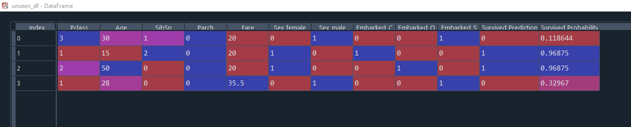
We can apply this model to brand new unseen data. In this example we have 4 new passengers. 2 males and 2 females.
# Pass in new unseen data to the model and get a prediction
columns = ["Pclass", "Age","SibSp","Parch","Fare","Sex_female",
           "Sex_male","Embarked_C","Embarked_Q", "Embarked_S"]

unseen_data = {
    "Pclass": [3, 1, 2, 1],
    "Age": [30, 15, 50, 28],
    "SibSp": [1, 2, 0, 0],
    "Parch": [0, 0, 0, 0],
    "Fare": [20.0, 20.0, 20.0, 35.5],
    "Sex_female": [0, 1, 1, 0],
    "Sex_male": [1, 0, 0, 1],
    "Embarked_C": [0, 1, 0, 0],
    "Embarked_Q": [0, 0, 1, 0],
    "Embarked_S": [1, 0, 0, 1]
}

unseen_df = pd.DataFrame(unseen_data, columns=columns)
predictions = model.predict(unseen_df)
probability = pd.DataFrame(model.predict_proba(unseen_df),
                           columns=["Did Not Survive %", "Survived %"])

unseen_df["Survived Prediction"] = predictions
unseen_df["Survived Probability"] = probability["Survived %"]
Here are the results showing both female passengers are predicted to survive with a 96.87% probability, whereas both male passengers are not predicted to survive, with 11.86% (this profile matches Mike from earlier!) and 32.96% probability.
Decision trees can be prone to overfitting as there is only one 'tree'. A Random Forest model can overcome this by assessing many trees using subsets of the data to avoid overfitting. You can still ouput feature importances with a Random Forest model, and they are generally more accurate, but are harder to explain to others!
I will cover Logistic Regression and Random Forest models for classification in another article. Both are good alternative options.
The maximum depth of a decision tree determines the number of levels in the tree and directly impacts the complexity of the decision boundary. By setting a higher maximum depth, the decision tree can capture more complex relationships in the data, potentially resulting in a more intricate decision boundary. Conversely, reducing the maximum depth can lead to a simpler decision boundary.
Rules-based Classifier example
An alternative approach to the Titanic classification problem is to use a rules based approach. Rule-based models typically provide deterministic predictions (0 or 1) based on the conditions of the rules. They do not inherently provide probabilistic outputs or confidence levels associated with predictions, which can be valuable for certain applications.
Despite these limitations, rule-based models can still be valuable in certain scenarios, especially when interpretability and explainability are essential requirements. They are often used in domains where human-understandable decision rules are preferred, such as expert systems, regulatory compliance, or auditing. Here's an example of implementing a rules based model in Python using the Titanic dataset:
data = pd.read_csv('https://raw.githubusercontent.com/datasciencedojo/datasets/master/titanic.csv')

# Define rules
rules = [
    {'condition': (data['Sex'] == 'female') & (data['Pclass'] <= 2) & (data['Age'] <= 50), 'prediction': 1},
    {'condition': (data['Sex'] == 'female') & (data['Pclass'] <= 2) & (data['Age'] > 50), 'prediction': 0},
    {'condition': (data['Sex'] == 'female') & (data['Pclass'] > 2), 'prediction': 1},
    {'condition': (data['Sex'] == 'male') & (data['Age'] <= 10), 'prediction': 1},
    {'condition': (data['Sex'] == 'male') & (data['Age'] > 10) & (data['Fare'] > 20), 'prediction': 1}
]

# Apply rules to make predictions
predictions = []
for rule in rules:
    condition = rule['condition']
    prediction = rule['prediction']
    predictions.append(condition & (data['Survived'] == prediction))

# Combine predictions
final_prediction = pd.concat(predictions, axis=1).any(axis=1)
data["Predicted"] = final_prediction.replace({True: 1, False: 0})

# Calculate accuracy
rules_based_model_accuracy = sum(final_prediction == data['Survived']) / len(data)
We define a list of rules, where each rule consists of a condition and a prediction. The condition is a boolean expression based on the features in the dataset, and the prediction represents the outcome if the condition is satisfied.
We then iterate over the rules and apply them to the dataset to make predictions. Each rule is evaluated as a boolean condition, and the predictions are stored in a list.
Finally, we combine the predictions using the logical OR operation, and compare the final prediction with the actual target variable ('Survived') to calculate the accuracy of the rule-based model. The accuracy of this model is 91.58% which suggests the rules are quite overfit, but that's okay if we want rigid well defined rules that are easily explainable, it's a trade off.
Regression and Explainable AI
Regression is a type of supervised learning task that predicts continuous numerical values based on input variables. Explainable AI techniques in regression help us understand how the model estimates the relationship between the input features and the target variable. Here are some common XAI methods used in regression:
Partial Dependence Plots: Partial dependence plots visualize the relationship between a target variable and one or more input features while keeping other features fixed. These plots provide insights into how changes in the input variables impact the predicted outcome.
Feature Contribution: Feature contribution methods quantify the impact of each input feature on the regression model's predictions. They help identify the most influential features and their corresponding effects, aiding interpretability.
Model Simplification: Model simplification techniques aim to create simpler, more interpretable models that approximate the behavior of complex regression models. This simplification enhances transparency and enables easier comprehension of the underlying relationships.
Linear Regression example
We will use a scikit-learn Linear Regression model with the Boston Housing dataset to train a model to predict house prices. It's another well known dataset.
There are 14 attributes in each case of the dataset. They are:
- CRIM - per capita crime rate by town
- ZN - proportion of residential land zoned for lots over 25,000 sq.ft.
- INDUS - proportion of non-retail business acres per town.
- CHAS - Charles River dummy variable (1 if tract bounds river; 0 otherwise)
- NOX - nitric oxides concentration (parts per 10 million)
- RM - average number of rooms per dwelling
- AGE - proportion of owner-occupied units built prior to 1940
- DIS - weighted distances to five Boston employment centres
- RAD - index of accessibility to radial highways
- TAX - full-value property-tax rate per $10,000
- PTRATIO - pupil-teacher ratio by town
- B - 1000(Bk - 0.63)^2 where Bk is the proportion of blacks by town
- LSTAT - % lower status of the population
- MEDV / target - Median value of owner-occupied homes in $1000's
We follow the same pattern as our first example.
import math
import numpy as np
import pandas as pd
from sklearn.model_selection import train_test_split
from sklearn.linear_model import LinearRegression
from sklearn.metrics import (
    mean_squared_error,
    mean_absolute_error,
    median_absolute_error,
    r2_score
)
import matplotlib.pyplot as plt
import seaborn as sns

# Load the Boston Housing dataset
from sklearn.datasets import load_boston
boston = load_boston()

# Create a DataFrame from the dataset
data = pd.DataFrame(boston.data, columns=boston.feature_names)
data['target'] = boston.target

# Split the data into training and testing sets
X_train, X_test, y_train, y_test = train_test_split(
    data.drop('target', axis=1),
    data['target'],
    test_size=0.2,
    random_state=42
)

# Create and train the linear regression model
model = LinearRegression()
model.fit(X_train, y_train)

# Make predictions on the test set
y_pred = model.predict(X_test)
The correlation coefficient ranges from -1 to 1. If the value is close to 1, it means that there is a strong positive correlation between the two variables. When it is close to -1, the variables have a strong negative correlation.
We can now evaluate the accuracy of the model.
# Calculate the residuals
residuals = y_test - y_pred

results = pd.DataFrame({'Actual': y_test,
                        'Predicted': y_pred,
                        'Residuals': residuals,
                        'Absolute Residuals': abs(residuals)})

# Identify incorrect predictions
results['Prediction Status'] = results['Absolute Residuals'] <= 5
close_predictions_count = len(results[results['Absolute Residuals'] <= 5])
results['Prediction Status'] = results['Prediction Status'].replace({
    True: 'Prediction +/- $5000',
    False: 'Prediction > $5000'
})

# Evaluate the model
print('Mean Square Error      = ' + str(mean_squared_error(y_test, y_pred)))
print('Root Mean Square Error = ' + str(math.sqrt(mean_squared_error(y_test, y_pred))))
print('Mean Absolute Error    = ' + str(mean_absolute_error(y_test, y_pred)))
print('Median Absolute Error  = ' + str(median_absolute_error(y_test, y_pred)))
print('R2                     = ' + str(r2_score(y_test, y_pred)))
print('')
print('% within +/- $5000     = ' + str(close_predictions_count / len(results)))
| Evaluation metric | Value |
|---|---|
| Mean Square Error | 24.29112 |
| Root Mean Square Error | 4.928602 |
| Mean Absolute Error | 3.189092 |
| Median Absolute Error | 2.324332 |
| R2 | 0.668759 |
| % within +/- $5000 | 0.862745 |
In general, an R2 value of 0.66 means that approximately 66% of the variation in the target variable is explained by the regression model. This implies that the model captures a substantial portion of the underlying patterns in the data and performs better than simply using the mean value of the target variable for prediction. However, it also indicates that there is still some unexplained variation in the target variable that the model does not account for.
- The Mean Squared Error (MSE) is a measure of how close a fitted line is to data points. The Root Mean Squared Error (RMSE) is just the square root of the mean square error. That is probably the most easily interpreted statistic, since it has the same units as the quantity plotted on the vertical axisd.
- Root Mean Squared Error (RMSE): RMSE is the square root of the mean squared error and provides an interpretable metric in the same unit as the target variable. It penalizes larger errors more heavily compared to MSE.
- Mean Absolute Percentage Error (MAPE): MAPE measures the average percentage difference between the predicted and actual values. It is particularly useful when the scale of the target variable varies significantly.
- Coefficient of Determination (Adjusted R-squared): R-squared measures the proportion of the variance in the target variable explained by the regression model. Adjusted R-squared adjusts for the number of features in the model, penalizing the addition of irrelevant features.
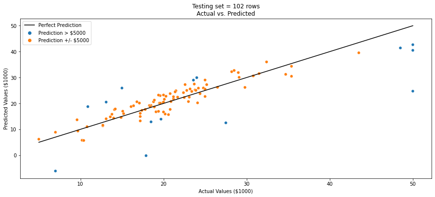
We can now use the scatter plot below to compare the actual target values with the predicted values. This visualisation helps assess how closely the model's predictions align with the true values. I have highlighted those predictions the were within +/- $5000 as these can be assumed to be accurate.
# Visualize actual vs predicted plot
plt.figure(figsize=(15, 6))
sns.scatterplot(x='Actual',
                y='Predicted',
                hue='Prediction Status',
                data=results)
sns.lineplot(x=results['Actual'],
             y=results['Actual'],
             color='black',
             label='Perfect Prediction')
plt.title(f'Testing set = {len(y_test)} rows\nActual vs. Predicted')
plt.xlabel('Actual Values ($1000)')
plt.ylabel('Predicted Values ($1000)')
plt.show()
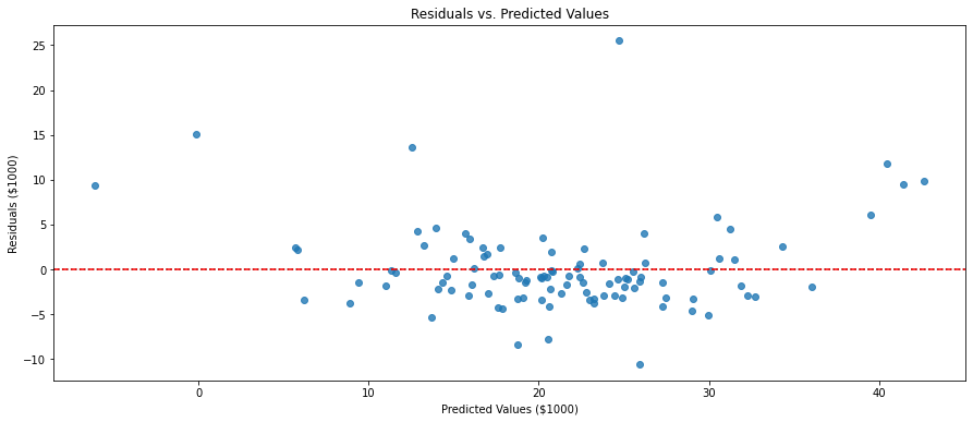
Residuals, in the context of regression analysis, refer to the differences between the observed (actual) values and the predicted values obtained from a regression model. By examining the residuals, we can assess how well the regression model captures the patterns and trends in the data. A desirable regression model should have residuals that exhibit certain properties, such as being normally distributed around zero, showing no systematic patterns or trends, and having consistent variability across the range of the predicted values.
We can create a residuals plot like the one below. The residuals were calculated by subtracting the predicted values y_pred from the actual values y_test.
The residplot() function from seaborn is used to create the residuals vs. predicted values plot. It automatically fits and plots a linear regression line to the data points. The plot displays the relationship between the predicted values and the residuals.
The horizontal line at y=0 serves as a reference line to indicate where the residuals should ideally be centered. Residuals above the line indicate overestimation, while residuals below the line indicate underestimation.
# Create the residuals vs. predicted values plot using seaborn
plt.figure(figsize=(15, 6))
sns.residplot(x=y_pred, y=residuals)
plt.axhline(y=0, color='red', linestyle='--')
plt.title('Residuals vs. Predicted Values')
plt.xlabel('Predicted Values ($1000)')
plt.ylabel('Residuals ($1000)')
plt.show()
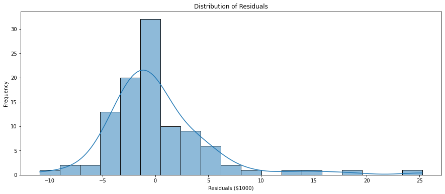
Visualising the distribution of residuals can help too. A histogram or a kernel density plot of the residuals can help assess if they are normally distributed. Deviations from normality may indicate model misspecification or the presence of outliers. We can see in this distribution that most residuals are within $5000 either way which we also found in our earlier actual vs predicted chart.
# Create a histogram of residuals using seaborn
plt.figure(figsize=(15, 6))
sns.histplot(residuals, kde=True)
plt.title('Distribution of Residuals')
plt.xlabel('Residuals ($1000)')
plt.ylabel('Frequency')
plt.show()
Finally, to figure out which features are most important to this model's predictions we can examine their coefficients to provide insights into the relationships between the features and the target variable. I have used abs() to rank absolute coefficients, regardless of whether they were positive or negative relationships.
# Interpret the model
coefficients = pd.DataFrame({
    'Feature': list(X_train.columns.values),
    'Coefficient': model.coef_,
    'Absolute Coefficient': abs(model.coef_)
})

feature_importance = coefficients.sort_values('Absolute Coefficient',
                                              ascending=False).reset_index(drop=True)
| Feature | Coefficient | Absolute Coefficient |
|---|---|---|
| NOX | -17.2026 | 17.20263 |
| RM | 4.438835 | 4.438835 |
| CHAS | 2.784438 | 2.784438 |
| DIS | -1.44787 | 1.447865 |
| PTRATIO | -0.91546 | 0.915456 |
| LSTAT | -0.50857 | 0.508571 |
| RAD | 0.26243 | 0.26243 |
| CRIM | -0.11306 | 0.113056 |
| INDUS | 0.040381 | 0.040381 |
| ZN | 0.03011 | 0.03011 |
| B | 0.012351 | 0.012351 |
| TAX | -0.01065 | 0.010647 |
| AGE | -0.0063 | 0.006296 |
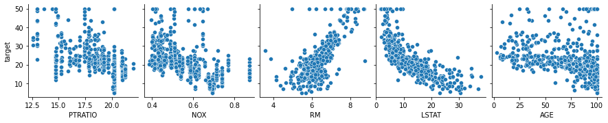
We can confirm these relationships using a pairplot with high coefficient features plotted against the target (median house price).
# Confirm feature importance with correlation pairplot
plt.figure(figsize=(30, 20))
sns.pairplot(data,
             y_vars = ['target'],
             x_vars = ['PTRATIO', 'NOX', 'RM', 'LSTAT', 'AGE'])
plt.show()
We can further enhance our understanding using a correlation heatmap for all features. I have opted to set a threshold of more than 0.4 or less than -0.4 here to only display important correlations which makes this visual much easier to read. You can just pass in correlation instead of masked_corr_matrix if you want to view them all.
# Check this against a Pearson correlation heatmap
# Only keep important correlations (more than 0.4 or less than -0.4)
correlation = data.corr()
masked_corr_matrix = correlation[(correlation > 0.4) | (correlation < -0.4)]
plt.figure(figsize=(20, 10))
sns.heatmap(masked_corr_matrix,
            cmap="coolwarm",
            annot=True,
            fmt='.2f',
            linewidths=.05).set_title("Correlation Heatmap")
plt.show()
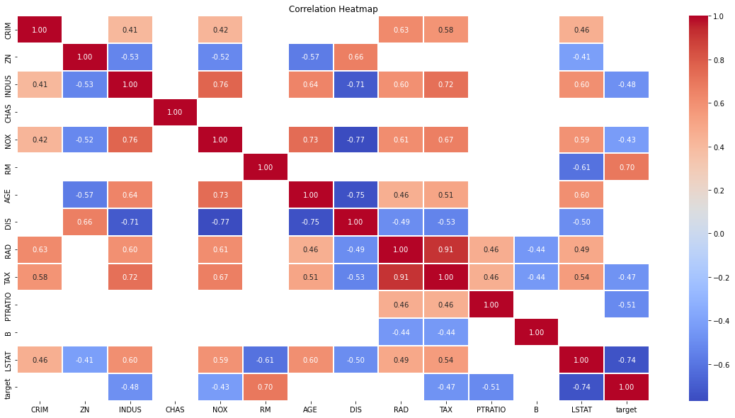
Another important point in selecting features for a linear regression model is to check for multicolinearity. The features RAD, TAX have a correlation of 0.91. These feature pairs are strongly correlated to each other. This can affect the model. Same goes for the features DIS and AGE which have a correlation of -0.75. We kept all the features in this example for simplicity.
Clustering and Explainable AI
Clustering is an unsupervised learning task that involves grouping similar data points together based on their inherent patterns or characteristics. Although clustering lacks explicit labels, XAI techniques can still play a crucial role in understanding and validating the clustering results. Here are a few XAI methods in clustering:
Cluster Visualization: Visualizing the clustering results helps us understand how the data points are grouped together. Techniques like scatter plots, heatmaps, or dendrograms provide a visual representation of the clusters, aiding in interpretation.
Cluster Profiling: Cluster profiling techniques analyze the characteristics of each cluster, such as mean values, distribution, or other statistical measures. These profiles provide insights into the defining features of each cluster, enhancing interpretability.
Dimensionality Reduction: Dimensionality reduction methods, such as Principal Component Analysis (PCA) or t-SNE (t-Distributed Stochastic Neighbor Embedding), can help reduce the high-dimensional input space to a lower-dimensional representation that is more easily understandable and interpretable.
K-means example
For this example we will use the Palmer Penguins dataset. It is created by Dr. Kristen Gorman and the Palmer Station, Antarctica LTER. This dataset contains the data of 344 penguins. Just like in the Iris dataset, there are 3 different species of penguins coming from 3 islands in the Palmer Archipelago. These three classes are Adelie, Chinstrap, and Gentoo. So we could use this dataset for classification supervised learning (labelled data).
But unlike the other examples we've seen, since clustering and dimensionality reduction are unsupervised methods, we will pretend we don't know what the classes are. We are only interested in grouping similar data points together based on their characteristics, helping us discover patterns and structure in data without pre-defined categories. This has real world uses including customer segmentation, market research and social network analysis.
We will use K-means clustering which is an unsupervised algorithm that groups data points into K distinct clusters based on their proximity to the cluster centroids. It iteratively assigns data points to the nearest centroid and updates the centroids until convergence, aiming to minimize the within-cluster sum of squares.
It's important to note that the clustering model is a tool to assist us in organizing and understanding data, but it doesn't provide definitive answers or predictions.
import pandas as pd
from sklearn.cluster import KMeans
from sklearn.decomposition import PCA
from sklearn.preprocessing import StandardScaler
from sklearn.metrics import silhouette_score
import matplotlib.pyplot as plt
import seaborn as sns

# Load the Palmer Penguin dataset
url = 'https://raw.githubusercontent.com/mwaskom/seaborn-data/master/penguins.csv'
data = pd.read_csv(url)

# Drop missing
data = data.dropna()

# Keep species as known labels
known_labels = data['species'].values

# Select relevant features for clustering
features = data[['bill_length_mm',
                 'bill_depth_mm',
                 'flipper_length_mm',
                 'body_mass_g']]

# Scale the data
scaler = StandardScaler()
scaled_features = pd.DataFrame(scaler.fit_transform(features),
                               columns=features.columns)

# Perform clustering using K-means
kmeans = KMeans(n_clusters=3, random_state=42)
kmeans.fit(scaled_features)
labels = kmeans.predict(scaled_features)
centroids = kmeans.cluster_centers_
This will give us labels as our clusters.
Note that in this example, we have used three clusters (n_clusters=3) but you can adjust the number of clusters as per your requirements in other datasets and experiment with different cluster sizes.
# Add the cluster labels to the dataset
data['cluster'] = labels

# Profile each cluster using feature analysis
features_profile = data.groupby('cluster')\
    .agg(['mean', 'median', 'std'])

mean_features = data.groupby('cluster').mean()

# Compute the silhouette score to evaluate cluster quality
silhouette_avg = silhouette_score(scaled_features, labels)
After running this code, we add the predicted cluster labels back to the original data, and obtain the features_profile and mean_features values for each cluster, which will provide insights into the characteristics of the clusters by mean, median, and standard deviation. The mean feature values can help identify the statistical differences between clusters.
Mean feature values by cluster
| cluster | bill_length_mm | bill_depth_mm | flipper_length_mm | body_mass_g |
|---|---|---|---|---|
| 0 | 38.27674 | 18.12171 | 188.6279 | 3593.798 |
| 1 | 47.56807 | 14.99664 | 217.2353 | 5092.437 |
| 2 | 47.66235 | 18.74824 | 196.9176 | 3898.235 |
The silhouette score returned 0.58 before scaling and 1.00 after, which is a great silhouette score, they range between -1 and 1, with values closer to 1 indicating well-separated clusters and values closer to -1 indicating overlapping or poorly separated clusters.
We can produce a scatter plot visualisation using PCA to display the clusters in a two-dimensional space. By reducing the dimensionality of the data using PCA, we can project the data onto these principal components, effectively creating a lower-dimensional representation of the original data. This lower-dimensional representation allows us to visualise the data in a more manageable and interpretable way.
# Visualization using PCA
pca = PCA(n_components=2)
reduced_data = pca.fit_transform(scaled_features)

# Visualize the clusters
clustered_data = pd.DataFrame({'PCA Component 1': reduced_data[:, 0],
                               'PCA Component 2': reduced_data[:, 1],
                               'Cluster': labels})
plt.figure(figsize=(15, 10))
sns.scatterplot(data=clustered_data,
                x='PCA Component 1',
                y='PCA Component 2',
                hue='Cluster',
                palette='viridis')
plt.xlabel('PCA Component 1')
plt.ylabel('PCA Component 2')
plt.title('PCA Results')
plt.show()
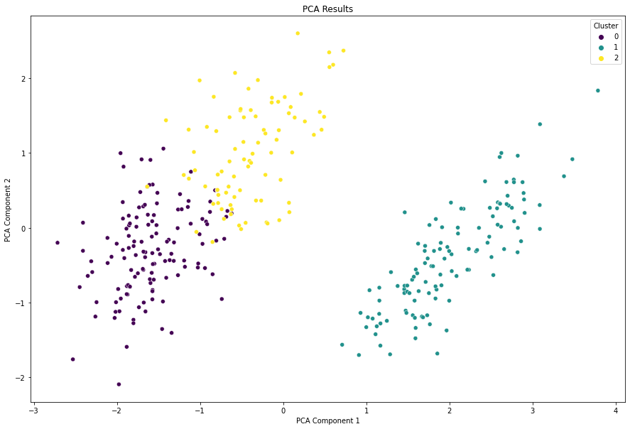
Although the axes in a PCA plot do not directly correspond to individual features, the contributions of the original features to each principal component can be quantified. The loadings of the features on the principal components indicate their relative importance in explaining the variability in the data. This information can be used to assess which features have the most influence on the overall patterns observed in the PCA plot.
loadings = pca.components_

# Calculate the squared loadings (squared weights) for each feature
feature_importance = np.square(loadings)

# Sum the squared loadings across principal components to get the total importance for each feature
total_importance = np.sum(feature_importance, axis=0)

feature_importance_df = pd.DataFrame({'Feature': scaled_features.columns, 'Importance': total_importance})
feature_importance_df = feature_importance_df.sort_values('Importance', ascending=False)
feature_importance_df = feature_importance_df.reset_index(drop=True)
| Feature | Importance |
|---|---|
| bill_depth_mm | 0.793125 |
| bill_length_mm | 0.566126 |
| flipper_length_mm | 0.332761 |
| body_mass_g | 0.307989 |
By calculating the squared loadings, we obtain the importance of each feature for each principal component. Summing the squared loadings across principal components provides the total importance for each feature. Finally, we sort the features based on their total importance to determine their ranking. As a general guideline, a common approach is to consider a total_importance value that captures a substantial amount of the variance in the data. For instance, a threshold of 0.80 or higher is often used, suggesting that the selected principal components account for at least 80% of the variance in the data.
At a higher level, we cannot view all of the features in two-dimensional space, but we can select two features to explore.
# Visualize the clusters with two variables
plt.figure(figsize=(15, 10))
sns.scatterplot(data=data,
                x='bill_length_mm',
                y='flipper_length_mm',
                hue='cluster',
                palette='viridis')
plt.xlabel('Bill Length (mm)')
plt.ylabel('Flipper Length (mm)')
plt.title('Clustering Results')
sns.scatterplot(x=centroids[:, 0],
                y=centroids[:, 2],
                hue=range(3),
                marker='X',
                s=200,
                palette=['black', 'black', 'black'],
                legend=False)
plt.show()
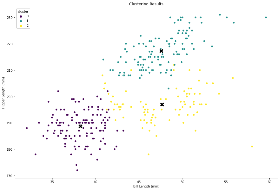
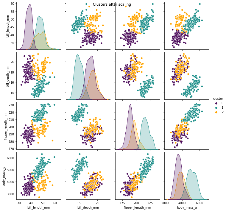
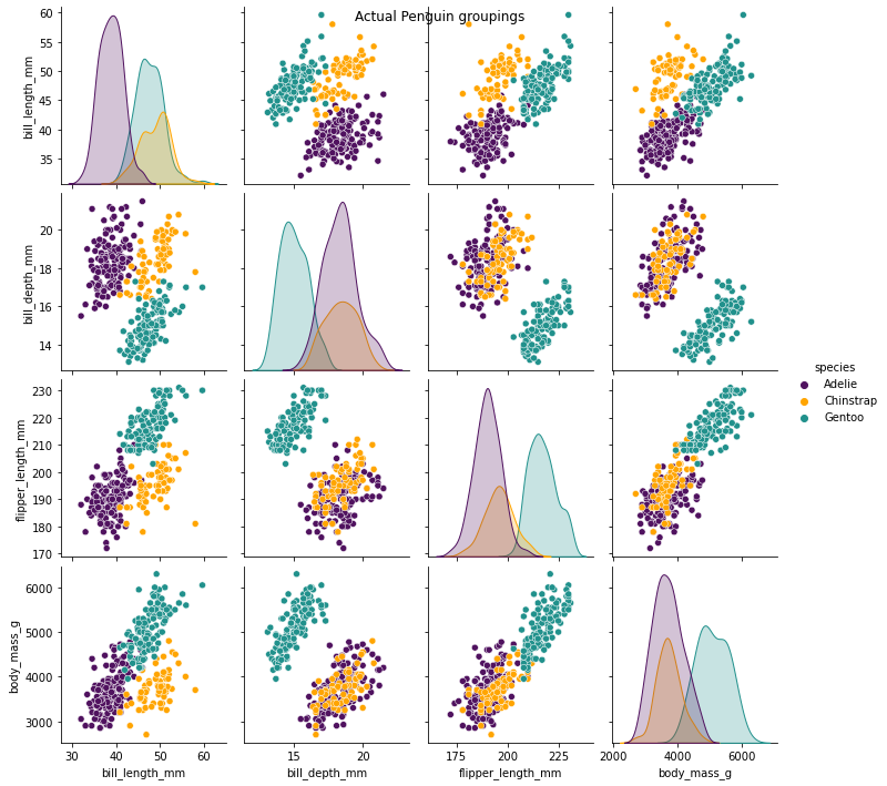
The following two images below show the clusters identified by the model after scaling the data, and the actual penguin groupings. We can see that the images almost perfectly align which shows this model is performing very well at identifying distinct cluster groupings. It was signficantly less accurate before scaling the data.
# Visualise the clusters in a pairplot
plt.figure(figsize=(30, 20))
sns.pairplot(data,
             hue="cluster",
             palette='viridis',
             vars = ['bill_length_mm',
                     'bill_depth_mm',
                     'flipper_length_mm',
                     'body_mass_g'])
plt.suptitle('Clusters after scaling')
plt.show()

# Visualise the actual penguin relationships and groupings
plt.figure(figsize=(30, 20))
sns.pairplot(data,
             hue="species",
             vars = ['bill_length_mm',
                     'bill_depth_mm',
                     'flipper_length_mm',
                     'body_mass_g'])
plt.suptitle('Actual Penguin groupings')
plt.show()
As a final piece of quality assurance, we can use a crosstab to examine the cluster labels vs known labels (species) to see how they align. The known labels won't usually be available in clustering problems because we're not trying to make a prediction, so this is a nice sense check whilst learning about using clustering.
# Quality assure (QA) our clusters against known penguin species
qa = pd.DataFrame({'labels': labels, 'species': known_labels})
qa = pd.crosstab(qa['labels'], qa['species'])
| Cluster | Adelie | Chinstrap | Gentoo |
|---|---|---|---|
| 0 | 124 | 5 | 0 |
| 1 | 0 | 0 | 119 |
| 2 | 22 | 63 | 0 |
We can see that Cluster 1 contains all Gentroo! Cluster 0 is mostly Adelie. Cluster 2 is the weakest with mostly Chinstrap but some Adelie. On the whole though, this suggests a very well performing clustering model. Once again, we're not trying to predict anything with clustering, only to identify clear groupings in the data, and ensure those groupings are explainable.
Benefits and importance of Explainable AI
The integration of XAI techniques into classification, regression, and clustering models offers several benefits:
-
Transparency: XAI methods provide transparency by revealing the inner workings of AI models, making them more understandable to users and stakeholders.
-
Trust: Enhanced explainability builds trust by enabling users to comprehend and verify the decisions made by AI systems.
-
Bias Detection: XAI techniques can help identify and mitigate biases present in AI models, ensuring fair and unbiased decision-making.
-
Compliance: In regulated industries, explainability is crucial for compliance with legal and ethical standards.
An article I found really interesting on all of these topics was 6 Lessons from a Data Scientist in the Banking Industry. A quote that really hit me during that article was:
I exclusively build models using logistic regression. I am not alone. From banking to insurance, much of the financial world runs on regression. Why?
Because these models work.
...
With regression, I ended up with models that had 8 to 10 features. Each of these features had to be thoroughly explained. A non-technical colleague had to agree they captured a relationship that existed in reality.
...
This was a source of disappointment. Leaving uni, I had learned so much about random forests, XGBoost and neural networks. I was excited to apply these techniques. In the first week, I remember one of my senior colleagues saying:
“Forget about all those fancy models”
This echoes that a simple model that is easy to explain to a non-technical audience, is better than a more accurate but more complex model that is much harder to explain.
Conclusion
Explainable AI is a rapidly evolving field that aims to make AI models more transparent and interpretable. By incorporating XAI techniques into classification, regression, and clustering, we can gain insights into the decision-making processes of these models. Enhanced transparency not only facilitates user understanding but also promotes trust, fairness, and accountability in AI systems. As AI continues to shape our world, it becomes imperative to prioritise explainability.
As always, if you enjoyed this article, be sure to check out other articles on the site. You may be interested in Concepts of Artificial Intelligence with Python - a review of CS50 AI.