Building a website analytics dashboard with Power BI and Google Sheets

In a previous article I demonstrated creating a website analytics solution using AWS Lambda and Google Sheets. The data collected was then used to build a Power BI dashboard. I chose Power BI because I’ve worked with it in a professional setting, and for quickly putting together high quality, interactive dashboards, it’s very good. There are a few gotchas to watch out for with it, but on the whole it’s quite straightforward to use.
In this article, we’ll go over how I built the usage analytics dashboard for this site and in the process you’ll learn some fundamental Power BI skills. Unlike some tutorials, this is a real world use case, many workplaces have digital products and want to monitor how well they are performing to improve them for their customers. Although this tutorial will be suitable for beginners, we'll be diving straight into the skills needed to build a professional report including using the Power Query Editor and DAX (data analysis expressions). I think jumping into the deep end is a good thing, gaps in understanding can be filled in later. Being able to import website usage data and turn it into valuable information is a very useful skill to have. By the end of this article you should be able to develop an entire dashboard from scratch without any prior knowledge of Power BI. Let’s begin!
Requirements
Firstly I set out a list of requirements of what metrics and functionality the dashboard would need to have:
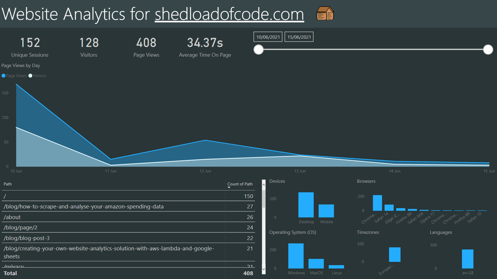
- Total visitors card
- Total page views card
- Total page views by device and timezone bar chart
- Total page views by browser and operating system bar chart
- Total views by path table
- Daily page views time series
- Hourly breakdown for any given day
- Date slicer
The finished product should end up looking something like this:
Download Power BI Desktop
Let's start by downloading Power BI Desktop. Once installed, open Power BI Desktop and you should arrive at a screen which looks like this:
Power BI Desktop receives monthly updates from Microsoft and the layout can change slightly. If you're ever interested in keeping up to date with the monthly updates, you can find them on the Power BI blog and review previous month's updates on this previous updates page.
The first thing you'll always want to do from this start screen, is click 'Get data'. That will be our starting point for the next section.
Building the report
Power BI Desktop has a very interactive interface with lots of things to click on! So rather than writing out all the steps with screenshots, I've added a video in this section that shows the whole dashboard building process from start to finish. This should make it much easier to follow along 😄 The steps in the video are:
- Get data from the Google Sheet using this URL: https://docs.google.com/spreadsheets/d/1jIUARNqb02c0xzTqj6AhE94M38WnAEcymSfsXfZm06s/edit?usp=sharing
- Change the URL ending from
/edit?usp=sharingto/export?format=xlsx - Transform data in Power Query by removing blank rows then adding a date, hour and index column
- Add calculated columns and measures with DAX to calculate visitors, page views and average time on page in seconds
- Create report visuals
- Style the report
- Add a drill through page for hourly analysis
- Add a toggle between browser, device, OS and timezone visuals using bookmarks
The Google Sheet data we're using is test data - not the live site data. It’s the same structure, but only contains logs from early testing activity. For step 4, you’ll find all the DAX you’ll need for it underneath the video.
DAX statements for step 4 as promised 😄
In step 4, you can see I'm first calculating the next row's session ID and created at date. Then if the session ID is different from the previous row, I know it's a completely different person / session. We can't predict how long that last page view event was, but for all the others we can calculate the time between dates using DATEDIFF to find TimeOnPageInSeconds. The average of that column gives the AverageTimeOnPageInSeconds measure - concatenated with an 's' so it displays units nicely in the visual. Allowing users to quickly interpret the units of measurement is very important.
Visitors
Visitors = CALCULATE(
    COUNT(
        EventsLog[EventType]
    ),
    EventsLog[EventType] = "Visit Site"
)
Page Views
Page Views = COUNT(EventsLog[EventType])
NextSessionId
NextSessionId =

VAR PreviousIndex =
CALCULATE(
    MAX( EventsLog[Index] ),
    FILTER(
        EventsLog,
        EventsLog[Index] < EARLIER( EventsLog[Index] )
    )
)

VAR Result =
CALCULATE(
    MAX( EventsLog[SessionId] ),
    FILTER(
        EventsLog,
        EventsLog[Index] = PreviousIndex
    )
)

RETURN Result
NextCreatedAt
NextCreatedAt =

VAR PreviousIndex =
CALCULATE(
    MAX( EventsLog[Index] ),
    FILTER(
        EventsLog,
        EventsLog[Index] < EARLIER( EventsLog[Index] )
    )
)

VAR Result =
CALCULATE(
    MAX( EventsLog[CreatedAt] ),
    FILTER(
        EventsLog,
        EventsLog[Index] = PreviousIndex
    )
)

RETURN Result
TimeOnPageInSeconds
TimeOnPageInSeconds =

IF(
    EventsLog[SessionId] <> EventsLog[NextSessionId],
    0,
    DATEDIFF(EventsLog[CreatedAt], EventsLog[NextCreatedAt], SECOND)
)
AverageTimeOnPageInSeconds
AverageTimeOnPageInSeconds = CONCATENATE(
    ROUND(
        AVERAGE(EventsLog[TimeOnPageInSeconds]),
        2
    ),
    "s"
)
In step 7 I used a drill through page. To use drill through, a user must right-click a data point in another report page, and drill through to the focused page to get details that are filtered to that context. This effectively 'filters' the destination page by whichever data point you drilled through on. In our case, when you right click a Date data point on the time series on the 'Dashboard' page, you drill through to the 'Hourly Analysis' page, which breaks down the usage by hour for that day. This works because on the 'Hourly Analysis' we added the Date column to the drill through section, which enables drillthrough for any visual using that column. Once you wrap your head around that, it becomes a very powerful tool for providing deeper insight without overloading pages. You can use it to separate the main high-level visualisations from more low-level analysis. Some users might only want the high-level information, but more advanced users might want to drill through to the details. This let's you accomodate both. So usually I just want to see the day by day page views, but if I see a spike on any given day, I might drill through to see at what hours the page views happened.
In step 8 I used bookmarks to toggle between visuals. Bookmarks are created first and then can be linked to buttons. Bookmarks sort of 'take a snapshot' of which visuals are visible or hidden and what filters have been applied (if any). So in this case we have many buttons to only show one visual at a time, whilst hiding the others. We then attach those bookmarks to the buttons as actions, so when they are clicked that bookmark 'snapshot' is applied. This can be time consuming to set up, but works well for simple show and hide or toggle functionality like this. The main use for this is to avoid overcrowding your report page. It also gives it more of an app-like feel.
Job done! Where to next?
I hope you’ve enjoyed this tutorial, and have picked up some knowledge of Power BI you can use in other projects. You should now be able to build a robust professional dashboard from scratch, so well done! You might have noticed that using Power BI is as much about preparing and transforming the data, as it is about the visuals themselves. The 'garbage in, garbage out' principle is very important, your report will only ever be as good as the data fed into it. So always know your underlying data inside out and question the quality of it.
We used DAX to calculate the average time on the page in the tutorial, but did we really need that metric? Will knowing how much time a user spent on the page help to deliver a better product? It might, it might not. Knowing what to measure is the absolute key skill. Don't overcomplicate a report if you don't have to, keep it as simple as possible. Follow the quote 'Don’t include a single line in your code which you could not explain to your grandmother in a matter of two minutes' - one on the favourite quotes list and as applicable to analysis and reports as it is of code.
If you just keep including measures blindly, it will crowd the report with noise, and soon you'll face the dreaded analysis paralysis - you're tracking so much stuff but it doesn't offer any insight or call to action. I wanted a way to present some simple stats on how the site is being received, which pages are popular and which need improving. When presenting data, keep the audience and purpose in mind. Although that sounds simplistic, it can be easy to forget those things.
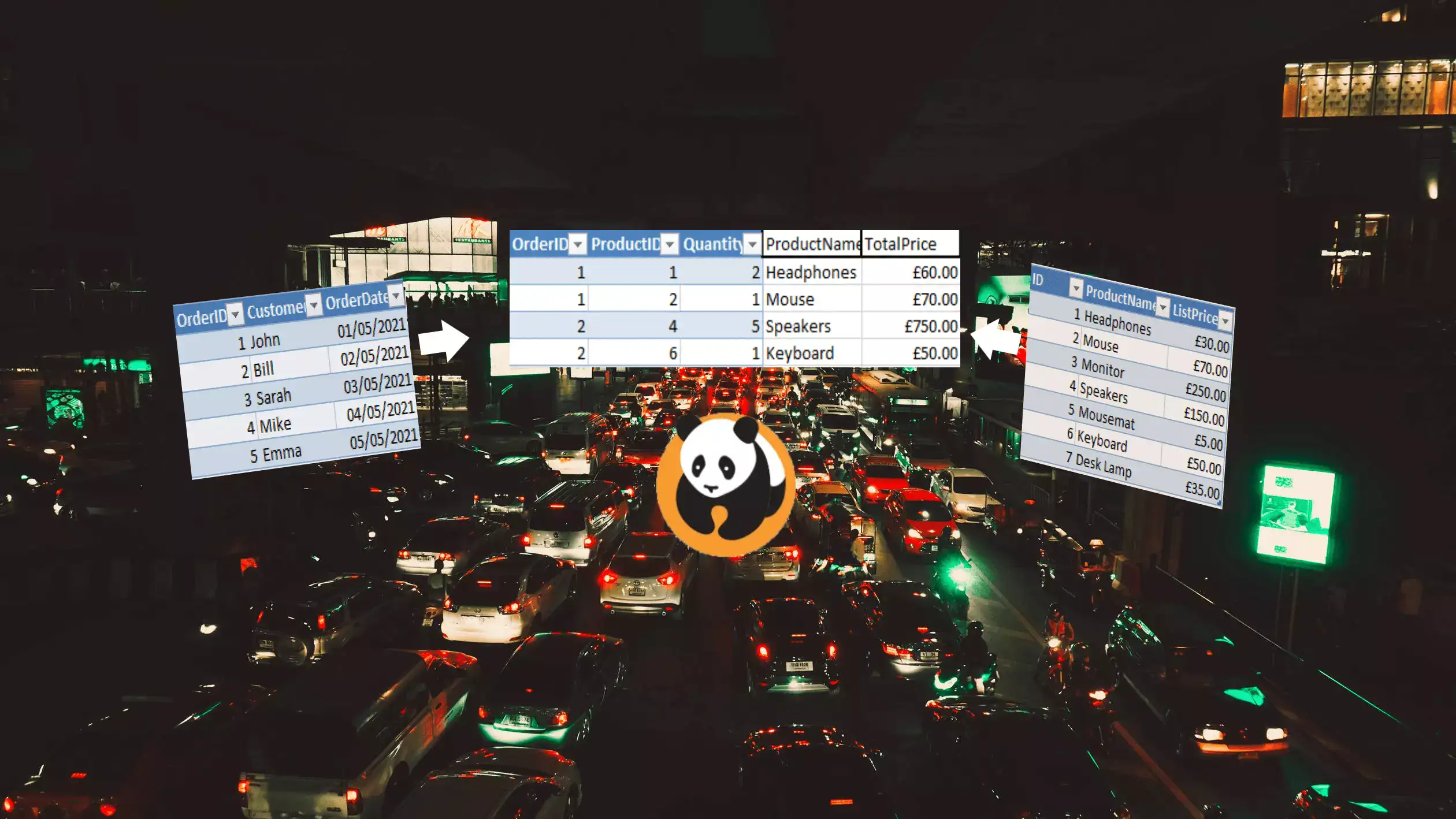
I think we’ve explored some key topics, but there is a lot more to learn for those who wish to. One thing we didn't cover is relationships, which are important for more complex multi-source data models. Here are my top recommendations for where to go next if you want to learn more about Power BI:
- Power BI Docs - Offical Power BI docs from Microsoft
- Analysing and Visualising Data with Power BI Course - full course from Microsoft
- Guy in a cube - great YouTube channel for Power BI tutorials
- SQLBI - articles on business intelligence, Power BI, DAX and more
- DAX reference - Browse DAX functions
- DAX reference - Browse DAX functions